
- On this Page
- Style & Appearance
- Examples
- Admin UI
- Recommendations
Style & Appearance
Description
Image blocks allow you to insert images into pages and other entries. The image block allows you to select and display one image per block.
Available Styles
- Image Block
- alignment
- span
- caption, credit, and credit URL on/off
- caption display style: inline/click reveal (added to Builder Feb '25)
IMAGE BLOCK
Image

Image with caption & credit. Caption is displayed inline.
This is a caption of an image.
Credit: Penn StateImage with caption & credit. Caption is displayed by click reveal.
Admin UI
Default Traits & Behaviors
- Images can be uploaded to Assets or can be uploaded from within image-based Content Builder blocks and channel entries.
- Some information about the image is connected with the image file, not the page where the image will be used. This means that if one image is used in multiple locations throughout a website, an update to a caption or credit will apply to every instance the image appears. (You can control what information displays at the page level using certain content builder blocks and toggle switches.)
- Every image must have a title and alt text. The alt text allows a screen reader to describe the image to learners with visual impairments and is required for WCAG 2.0+ accessibility compliance. The title does not need to be the same as the filename.
- ❕Note: alt text should succinctly describe the visual content to someone with visual impairments.
- Image captions, image credits, and a URL for the credit (such as copyright details or original source) may be added.
Interface view
Image Block - selecting the width, alignment, caption on/off, and caption display style.
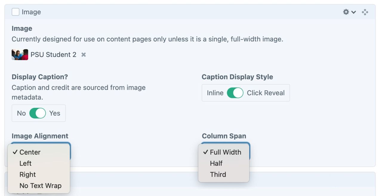
Alignment
Alignment options include:
- Center
- Left
- Right
- No Text Wrap (added to Builder Feb '25)
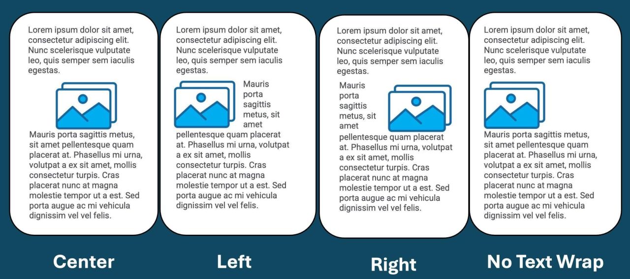
Alignment + Width
Full-width images fill the entire content area; alignment is irrelevant.
For partial-width images:
- In Left or Right alignment, the image will float alongside text and other page elements.
- When Center or No Text Wrap are selected, the image will NOT float alongside content; the text and other elements will appear above and below the image only.
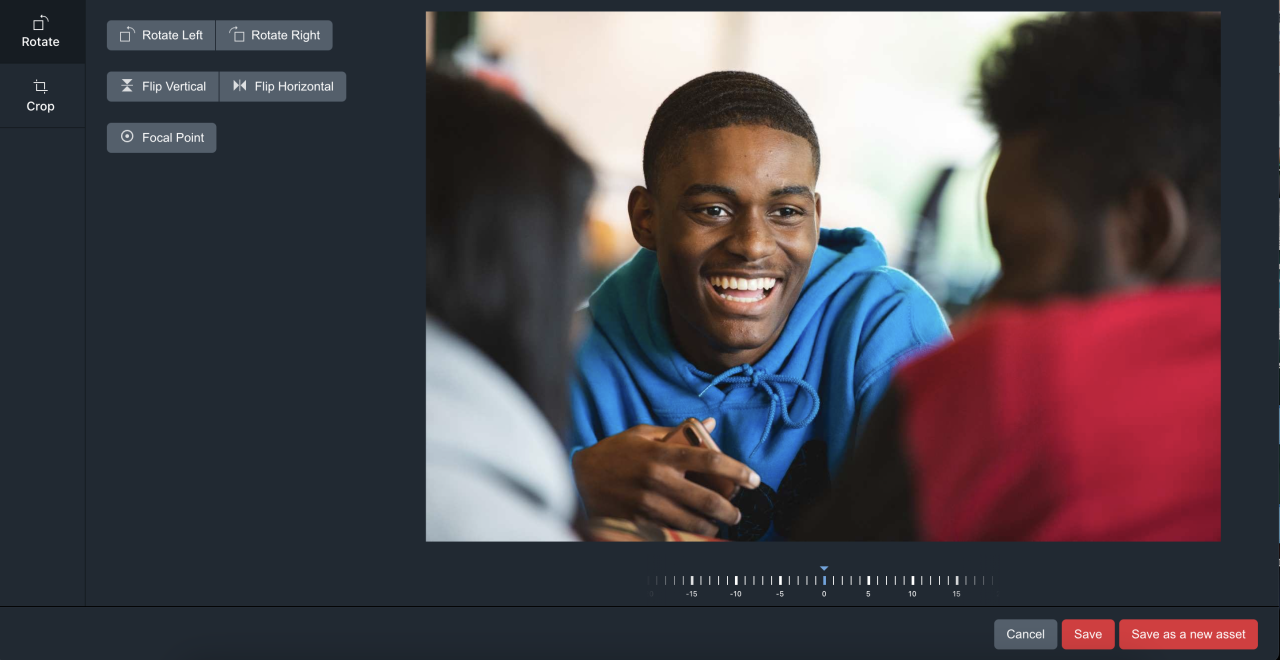
- To access and change details about an image, either click the title in the Assets list or double-click the image you’ve added to a page/entry. This opens an image panel where you can edit your image and related information. If you hover over the image, a button to Preview the image and a button to Edit the image will appear.
- Preview will allow you to view the image in a larger window, clicking Edit will open additional tools to crop, rotate, and adjust the image’s focal point.
- Focal Points - The focal point appears as a red dot during editing. You can drag the dot to the area of the image you want the page to prioritize when it renders the image in a window with a different ratio than the actual image. (for example: you provide a square image for a page element that is designed to display rectangular images. Your image will appear cropped when displayed. You can use the focal point to adjust how the image gets cropped - top and bottom equally? more on the bottom? More on the top? .)
- After making changes, you can overwrite the existing image by clicking “Save” or you can create a new version that reflects your edits by clicking “Save as a new asset.”
Recommendations
- Editors might appreciate the Quick Start guide, which includes information about images.
- Learn about web accessibility including alt text.
- Visit the Image Galleries documentation to learn more about creating image galleries.