
- On this Page
- Style & Appearance
- Examples
- Admin UI
- Recommendations
Style & Appearance
Description
Links that can give users a preview of content. This can be a combination of images, page titles, and preview text. Two blocks serve the purpose of providing a preview to content.
Available Blocks & Styles
- Preview - Offset Preview
- Preview Cards
- Standard
- Small
- Icon
- Text Card
- Text List
- Standard
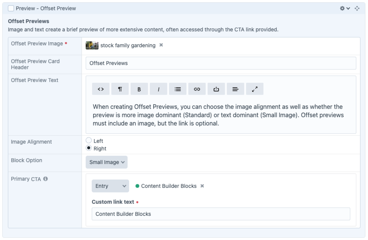
Preview - Offset Preview

Offset Previews
When creating Offset Previews, you can choose the image alignment as well as whether the preview is more image dominant (Standard) or text dominant (Small Image). Offset previews must include an image, but the link is optional.
Content Builder Blocks
Offset Previews
When creating Offset Previews, you can choose the image alignment as well as whether the preview is more image dominant (Standard) or text dominant (Small Image). Offset previews must include an image, but the link is optional.
Content Builder BlocksPreview Cards
Standard

Architecture of Craft CMS
Introduction to the Craft CMS Control Panel and terms used to describe the Craft data structure.

Content Builder Blocks
Elements of content that can be added to entries in the Content Builder.

Course Development
Courses are a distinct Builder structure for creating online learning experiences that include student tracking and assessment scoring.

Plug-ins
Third-party programmers develop applications that fully integrate with Craft CMS, including Formie, Navigation, and Site Redirects.
Small
Icon

Architecture of Craft CMS
Introduction to the Craft CMS Control Panel and terms used to describe the Craft data structure.

Content Builder Blocks
Elements of content that can be added to entries in the Content Builder.

Course Development
Courses are a distinct Builder structure for creating online learning experiences that include student tracking and assessment scoring.

Plug-ins
Third-party programmers develop applications that fully integrate with Craft CMS, including Formie, Navigation, and Site Redirects.
Text Cards
Architecture of Craft CMS
Introduction to the Craft CMS Control Panel and terms used to describe the Craft data structure.
Content Builder Blocks
Elements of content that can be added to entries in the Content Builder.
Course Development
Courses are a distinct Builder structure for creating online learning experiences that include student tracking and assessment scoring.
Plug-ins
Third-party programmers develop applications that fully integrate with Craft CMS, including Formie, Navigation, and Site Redirects.
Text List
Architecture of Craft CMS
Introduction to the Craft CMS Control Panel and terms used to describe the Craft data structure.
Content Builder Blocks
Elements of content that can be added to entries in the Content Builder.
Course Development
Courses are a distinct Builder structure for creating online learning experiences that include student tracking and assessment scoring.
Plug-ins
Third-party programmers develop applications that fully integrate with Craft CMS, including Formie, Navigation, and Site Redirects.
Examples
Preview Cards
- News Literacy - Basics (Standard)
- Grad School - Student Support (Standard)
- Learning Grief - What Counts as Loss (Small)
- University Ethics - Reporting Tool (Small)
- University Ethics - Reporting Child Abuse (Icon)
- Page Center (dev) (Text Cards)
- ??? (Text List)
Offset Previews
Admin UI
Default Traits & Behaviors
Offset Previews
- Image and text create a brief preview of more extensive content and provide a link to more.
- You must include an image, aligned to the right or left of the text.
- You must supply a title. You can optionally provide body text and a linked button.
- Standard Block style features a larger image, while the “Small Image” style accommodates text-heavy previews.
Preview Cards
- Standard
Large rectangular preview image above page title. Can optionally include preview text. Multiples wrap 1, 2, 3, 4 across, depending on screen size. - Small
Small square preview image to the left of page titles. Preview text display is not an option. Multiples wrap 1, 2, 3, 4 across, depending on screen size. - Icon
Small circle preview image above title, centrally aligned. Can optionally include preview text. Multiples wrap 1, 2, 3, 4 across, depending on screen size. - Text Cards
Rectangular boxes without images, but with an arrow icon. Includes page title. Can optionally include preview text. Multiples wrap 1, 2, 3, 4 across, depending on screen size. - Text List
Page title with a bullet (circle). Can optionally include preview text. Multiples do not wrap, but stack on top of one another. Multiples wrap 1, 2, 3, 4 across, depending on screen size.
Interface view
Recommendations
- Provide captions for videos with sound directly within the videos to meet accessibility standards using the service of your choice.
- Provide transcripts for audio files to meet accessibility standards. Transcripts are optional for videos if closed captions are provided. Transcript text may be entered in the rich text field within the content builder block. The word “Transcript +” will appear in a gray bar below the video if anything is entered in the transcript field.
Please contact the WPSU team if you frequently use another media hosting service so we can customize an option for you. This is far preferable to using inline widget iframe embeds as we can more sustainably make updates if embed code formatting changes in the future.