
- On this Page
- Style & Appearance
- Examples
- Admin UI
- Recommendations
Style & Appearance
Description
Flexible list provides alternative ways to display list information, including bullets, arrows, check marks, Xs, arrows, and numbers. The default style makes list items larger than regular body text and animates the list items so they appear on screen row by row.
NEW Fall 2025: Add headings to Flexible Lists.
Items in the list can be turned into headings with a toggle switch. Headings do not have the selected bullet point style (arrow, number, etc.) and appear in a strong typeface without indent.
Using headings within Flexible Lists preserves the intended reading order, which is important for web accessibility compliance.
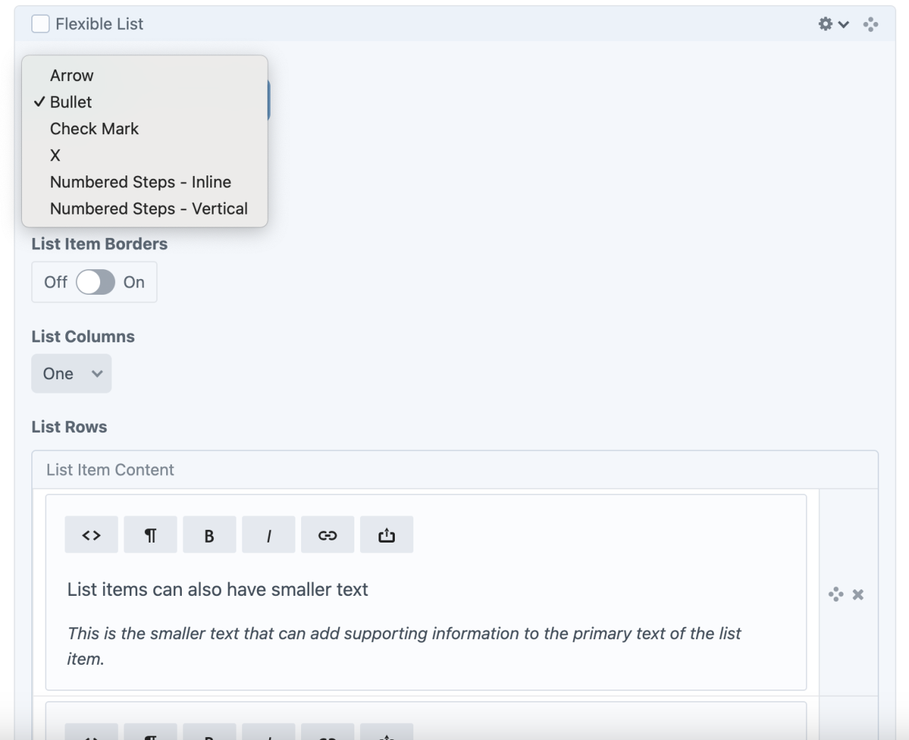
Available Styles
- Arrow
- Bullet
- Checkmark
- X
- Numbered Steps - Inline
- Numbered Steps - Vertical
Bullet
-
at vero eos et accusamus et iusto odio dignissimos ducimus, qui blanditiis praesentium
-
deleniti atque corrupti, quos dolores et quas molestias excepturi sint, obcaecati cupiditate non provident
-
similique sunt in culpa, qui officia deserunt mollitia animi, id est laborum et dolorum fuga.
Arrow
-
at vero eos et accusamus et iusto odio dignissimos ducimus, qui blanditiis praesentium
-
deleniti atque corrupti, quos dolores et quas molestias excepturi sint, obcaecati cupiditate non provident
-
similique sunt in culpa, qui officia deserunt mollitia animi, id est laborum et dolorum fuga.
Check Mark
-
at vero eos et accusamus et iusto odio dignissimos ducimus, qui blanditiis praesentium
-
deleniti atque corrupti, quos dolores et quas molestias excepturi sint, obcaecati cupiditate non provident
-
similique sunt in culpa, qui officia deserunt mollitia animi, id est laborum et dolorum fuga.
X
-
at vero eos et accusamus et iusto odio dignissimos ducimus, qui blanditiis praesentium
-
deleniti atque corrupti, quos dolores et quas molestias excepturi sint, obcaecati cupiditate non provident
-
similique sunt in culpa, qui officia deserunt mollitia animi, id est laborum et dolorum fuga.
Numbered Steps - Inline
The first step
The next step
The last step
Numbered steps - vertical
The first step
The next step
The last step
A bulleted list in three columns
-
list with columns
-
list with columns
-
list with columns
-
list with columns
-
list with columns
A bulleted list with supporting text
-
List items can also have smaller text
This is the smaller text that can add supporting information to the primary text of the list item.
-
List items can also have smaller text
This is the smaller text that can add supporting information to the primary text of the list item.
-
List items can also have smaller text
This is the smaller text that can add supporting information to the primary text of the list item.
List Sizing
Standard v. Small.
-
Standard size list
-
Standard size list
-
Standard size list
List supporting text is smaller than main
-
Small size list
-
Small size list
-
Small size list
List supporting text is smaller than main
Flexible Lists with Headings
One and two column examples. These examples use the check mark style, but you can use any style point.


Admin UI
Default Traits & Behaviors
Simply add list items, which can include links, but text formatting is determined by the list style.
Select the list type, number of columns, and borders to customize the look.
Interface view
Updated UI (Fall 2025)
Turn items into headings with a light switch.

Recommendations
- Achieve a variety of looks with different combinations
- Using headings within Flexible Lists preserves the intended reading order, which is important for web accessibility compliance. (Compared to using a combination of text blocks and flexible list blocks within a container of two or three items across.)