

Page Building
Tabs
When creating or editing entries, use the tabs to navigate through the entry.
Header Tab
This has to do with the top of the web page, just beneath the main navigational menu.
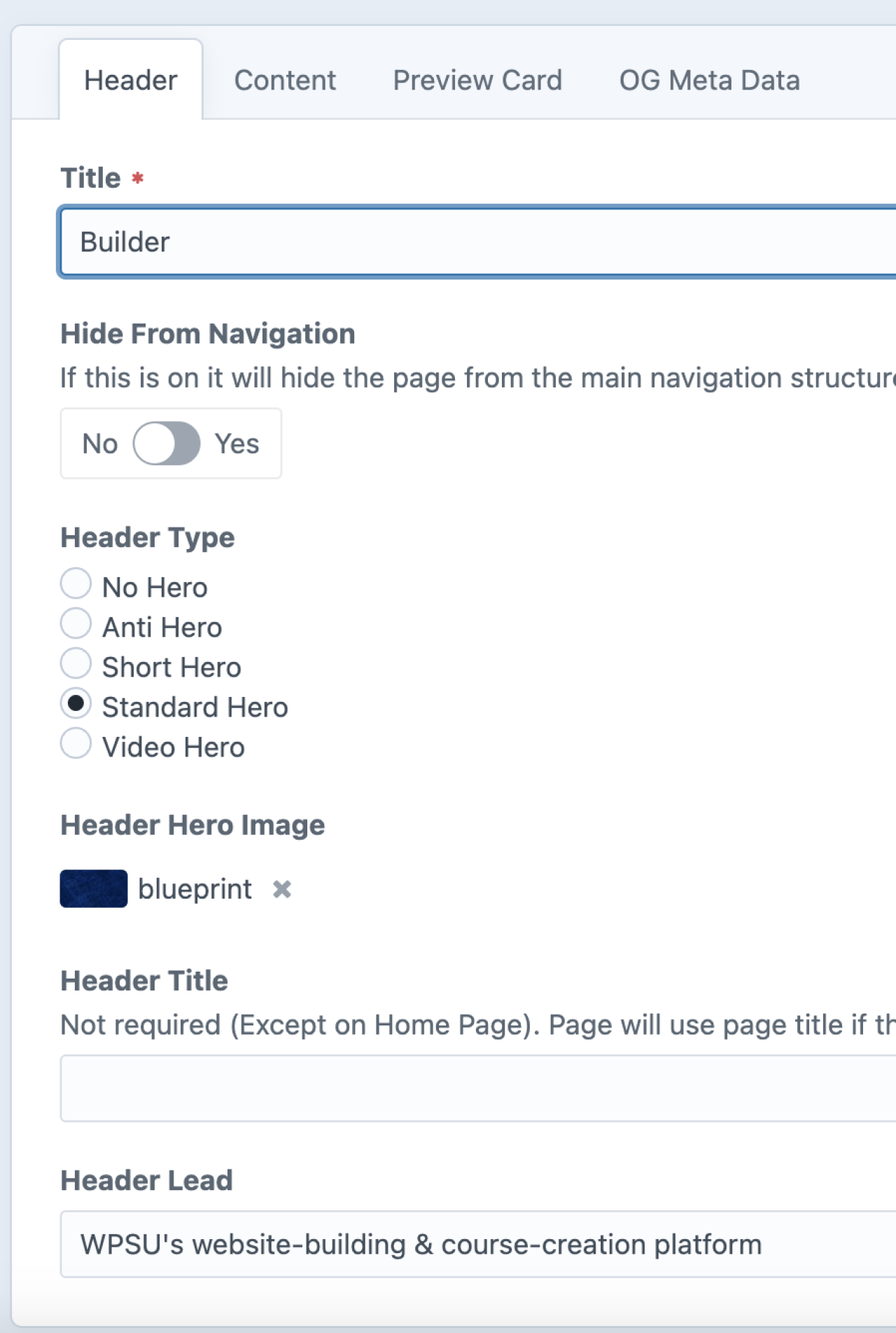
Title
How you recognize this page on the administrative console (backend) and the text that appears on a preview card. This can be the same as how the page is recognized to the website visitor (frontend).
Hide from Navigation
As of 2026, this has been moved to the "Settings" tab.
Header Type
Options for styling the top of the page.
-
No Hero
No color, texture, or image will appear at the top of the page; the page will start with the header title.
-
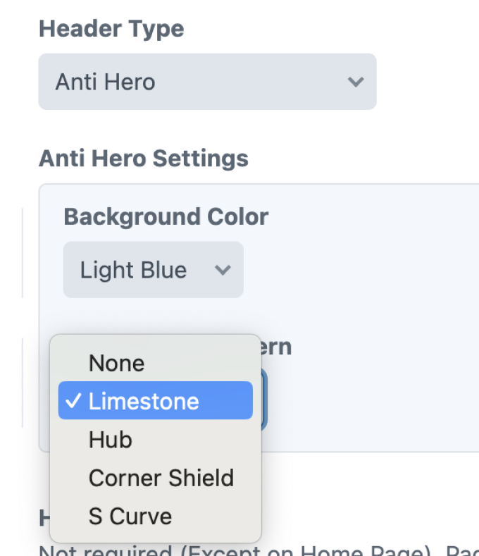
Anti-Hero
A color with texture will appear behind the header title. You can select the color and texture combination you would like to use from a list of options.

-
Short Hero
A narrow band of your image will appear at the top of the page; header title will appear below the image.
-
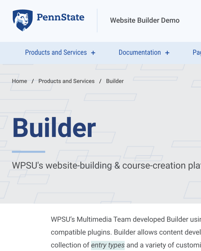
Standard Hero
A wide band of your image will appear at the top of the page; the header title and lead text will appear on top of the image. 16:7 aspect ratio.
-
Video Hero
Same as Standard Hero, but with video instead of a still image.
-
Header Hero Image
The image you would like to use for Short or Standard Hero.
-
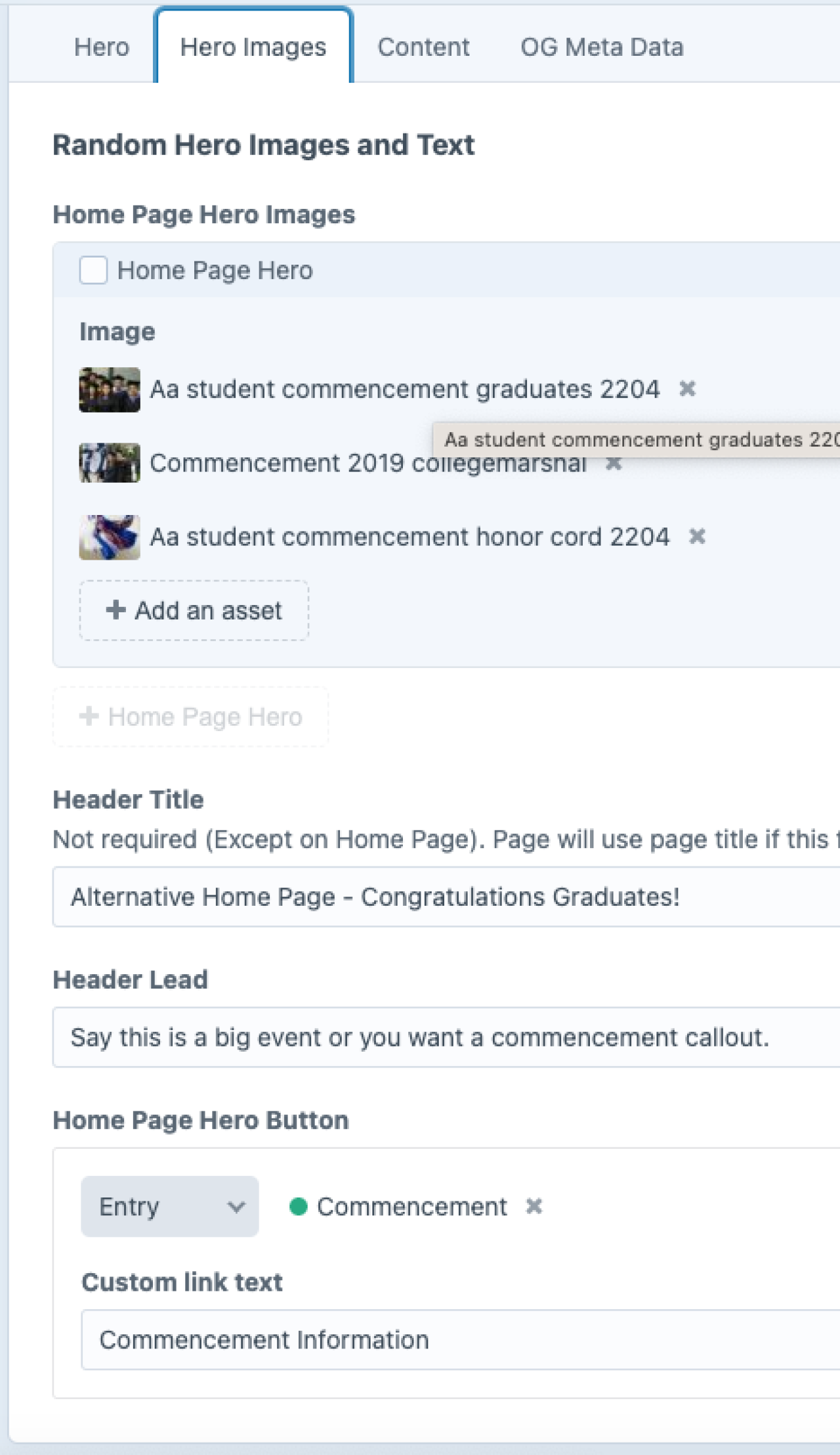
Header Title
The title of the page you want the frontend viewer to see (if the backend title is the same, you can leave this blank, and it will automatically use the information entered in “Title”).
-
Header Lead
Optional subtitle for your page.
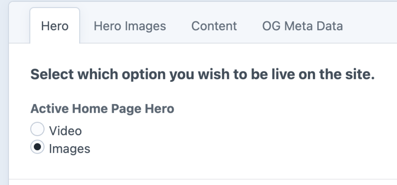
Homepage ONLY
Only on the home page, you have the option to toggle between a video and a set of images with a custom header and lead.
The images and text are curated on the Hero Images tab.

Standard Slim Switch - NEW Fall 2025
For Standard Hero, users can toggle a light switch to enable "Standard Slim," which has a 16:5 aspect ratio. (Compared to 16:7 ratio in regular Standard).

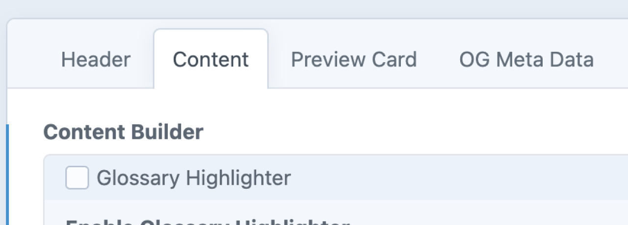
Content Tab
Add content to your entry by using Content Builder blocks or–in the case of Channel entries–by completing preset fields.
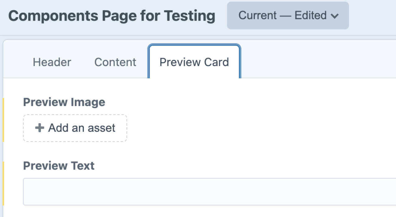
Preview Card
Previews serve as visual links to other pages. The links will include the page’s title, the preview image, and optional preview text. If your page does not have a preview image, it may use a global "fallback" image.
To display these images and information, you can add a Preview Cards content block on any page.

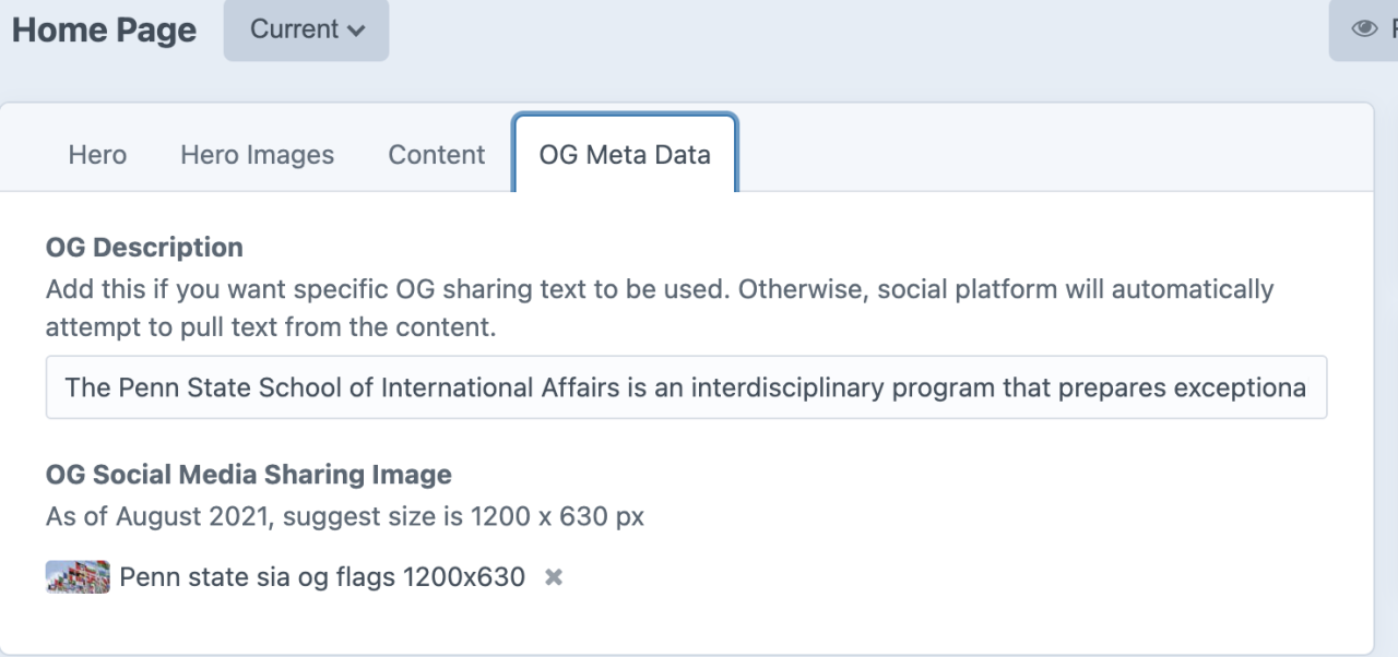
OG Meta Data
This is optional and not needed for every page, but we recommend you customize this for primary landing pages. Browser logic will pull something from the page if nothing is specified here.
Examples of where OG meta data appears when a URL is shared via chat, messaging, or social media.


Settings
The Settings tab was implemented to all Page entry types on Builder, Craft v4, in early 2026. The current options on this tab include: Hide from Navigation and Hide from Auto Preview Cards.

-
Hide from Navigation
If toggled on, this page will not appear in the main navigation structure, but allow it to be accessed via links, buttons, etc.
-
Hide from Auto Preview Cards
If toggled on, this page will not appear when and Auto Preview Card call is made by a parent page.

Entry types
Most pages are created with the Standard entry type, but Standard Sidenav and Link are two other options.
Side Bar
When the "Standard Sidenav" entry type is selected, a Sidebar tab appears.
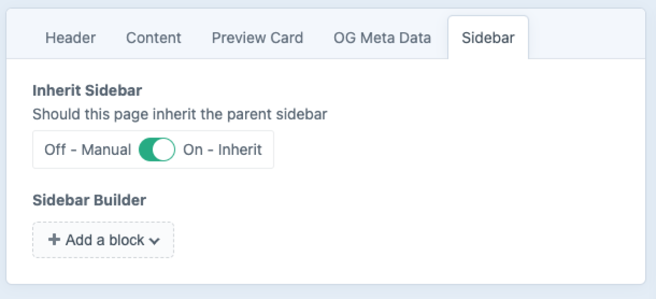
Inherit Sidebar
When selected, this option will automatically generate a sidebar based on the sidebar design of the parent page.
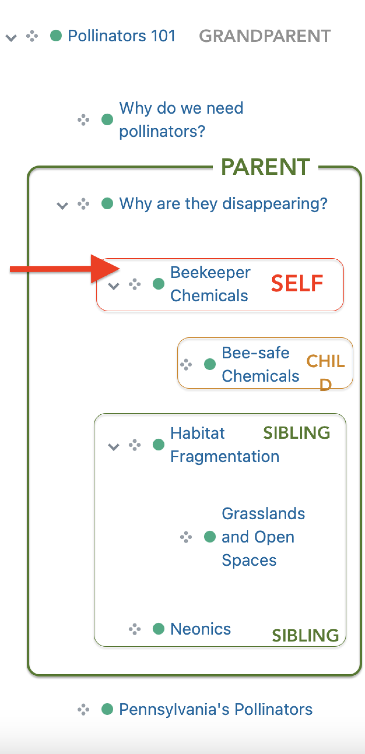
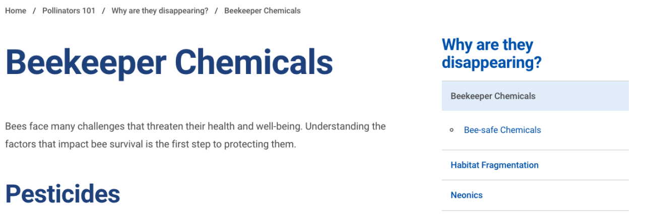
Note the relationship between the page structure in the Admin UI and how it appears in the sidebar, when "inherit sidebar" option is selected.
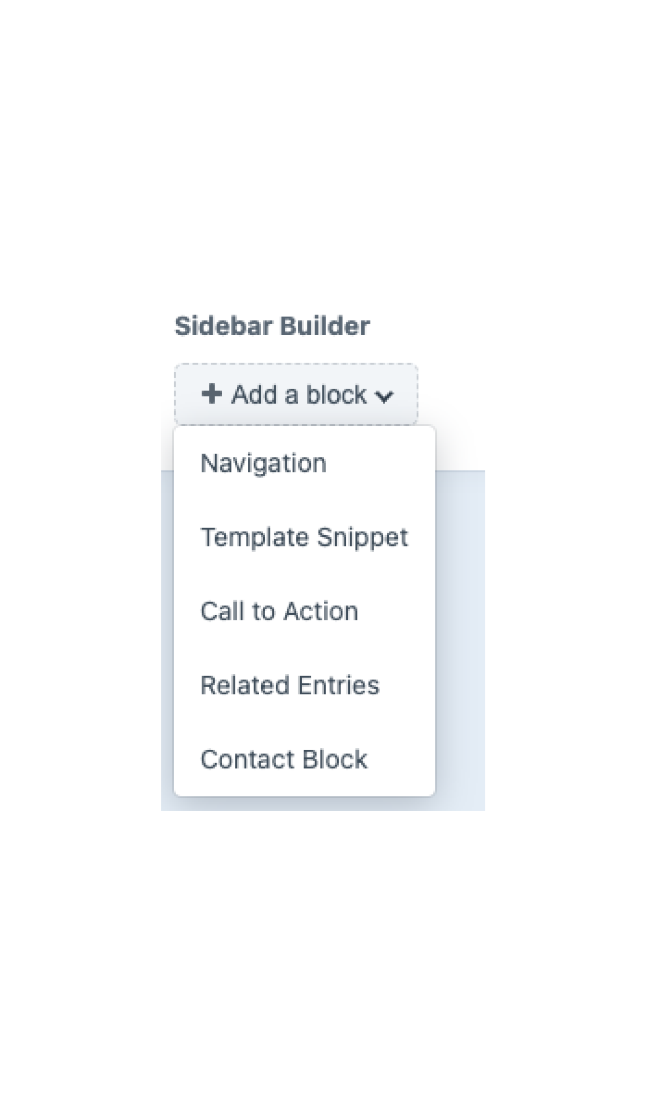
Sidebar Builder
Add blocks to build a custom sidebar, not necessarily related to the hierarchical structure of your pages. You can control the order these blocks display and you can repeat blocks.
- Contact Block - add a directory entry or office contact information
- Call to Action - make a button with a link. Select button background and font colors. 💡Tip: use your site’s brand colors or Penn State brand colors for a cohesive look!
- Navigation - provide a menu of pages based on the hierarchy; use this option if you want to include navigation with other sidebar builder blocks. Currently, one option is available: Siblings & Children (default).
- Related Entries - provide links to other pages within your site. Typically, these would be relevant to users on this page. Heading is optional.
- Template Snippet - insert a piece of code from a developer
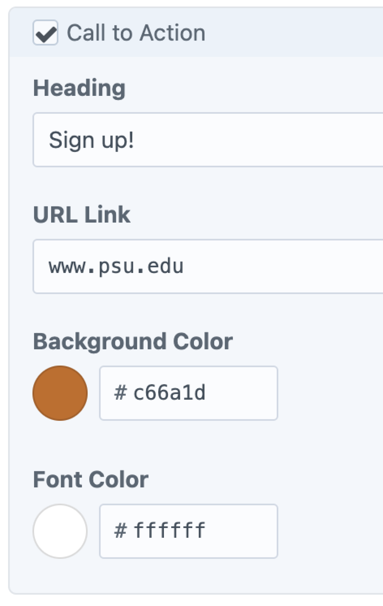
In the Sidebar Builder "Call to Action" block, provide a heading, URL, and colors.
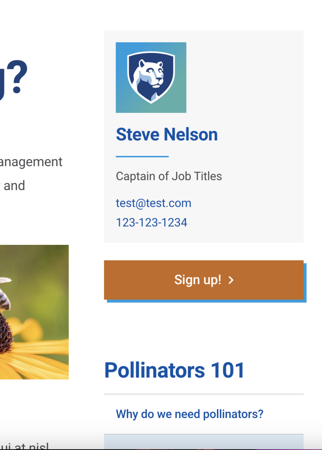
The Call to Action block will create a button in the sidebar.
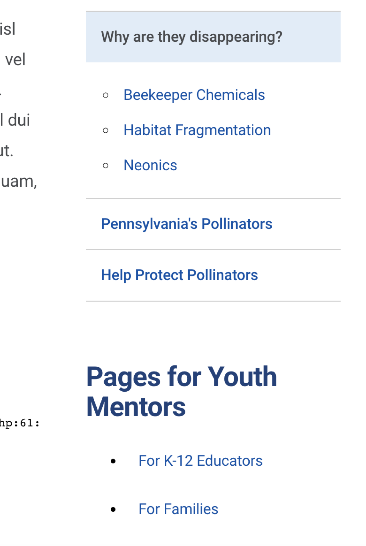
Use the "Related Entries" block to list another heading and linked pages.
Link
This allows you to have an item in your menu that goes to an external link (a page on a different website) or an internal link (a page within your own website).
Quick Start Guide for Client Editors
Download the PDF guide that provides a starting point to maintaining your website.