
- On this Page
- Style & Appearance
- Examples
- Admin UI
- Recommendations
Style & Appearance
Description
Galleries are collections of hand-selected images. This is a way to display multiple images.
Available Styles
Image Gallery Types:
- Masonry
- Slider
- Staggered
- Duo - Squares Left
- Duo - Squares Right
- Duo - Mixed Left
- Duo - Mixed Right
- Custom Grid - Native Proportions
- Custom Grid - Square Crop
Universal Options:
- Display captions (and credit) - NO (default) / YES
- Remove bottom padding - OFF (default)/ ON
Masonry
displays all images in tightly-packed rows and columns (like bricks). If the photos in a gallery have the same dimensions, the images will display in a perfect grid. When captions are provided and "Display Captions" is selected, captions will display as an icon overlay on the image, which the user can expand by clicking.


Slider
displays one image at a time. Captions, if present, display beneath the image slider. The slider forces images to display at the same height, but allows variation by width, so images are not clipped or distorted.


Staggered
(custom) similar to the masonry layout, but images display at slightly different widths, breaking up the grid appearance. When captions are provided and "Display Captions" is selected, captions will display as an icon overlay on the image, which the user can expand by clicking.
Duo Gallery Options
Duo galleries work well within containers, where text is alongside the duo gallery. When captions are provided and "Display Captions" is selected, captions will display as an icon overlay on the image, which the user can expand by clicking.
See better examples of this practice on the Gallery Options Testing Page.
- Duo - Squares Left
- Duo - Squares Right
- Duo - Mixed Left
- Duo - Mixed Right
Duo - Squares Left
Shown here with captions OFF.


Duo - Squares Right
Shown here with captions ON.
Caption test of three students having a discussion around a table
Caption test for a student wearing an old school Penn State sweatshirt while working on a computer
Duo Mixed Left
Shown here with captions OFF.


Duo Mixed Right
Shown here with captions ON.


Caption test of three students having a discussion around a table
Caption test for a student wearing an old school Penn State sweatshirt while working on a computer
Custom Grid
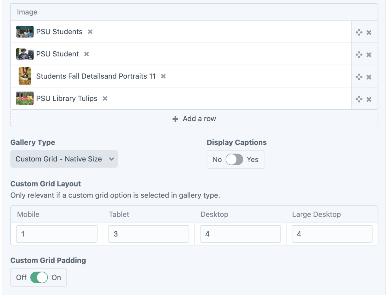
Custom grid allows users to add any number of photos to a grid gallery and specify how many images wide the gallery will be per screen size. For example, the galleries below are set at:
- 1 image wide on mobile
- 3 images wide on tablet
- 4 images wide on desktop (laptop)
- 4 images wide on large desktop
By default, there will be padding (space) between images in the gallery. For custom grid galleries, you can opt to remove padding. When captions are provided and "Display Captions" is selected, captions will display as an icon overlay on the image, which the user can expand by clicking.
Custom Grid galleries work well as their own full-width page element or alongside text, which can be achieved by using multiple columns in Container Start/End blocks.
See better examples of this practice on the Gallery Options Testing Page.
Custom Grid - Native Size
Retains the native proportions of images, so images may not have equal heights and widths, depending on the images selected.
Shown here with captions OFF.


Custom Grid - Square Crop
Shown here with captions ON


Admin UI
Default Traits & Behaviors
- Images can be uploaded to Assets or can be uploaded from within image-based Content Builder blocks and channel entries.
- Some information about the image is connected with the image file, not the page where the image will be used. This means that if one image is used in multiple locations throughout a website, an update to a caption or credit will apply to every instance the image appears. (You can control what information displays at the page level using certain content builder blocks and toggle switches.)
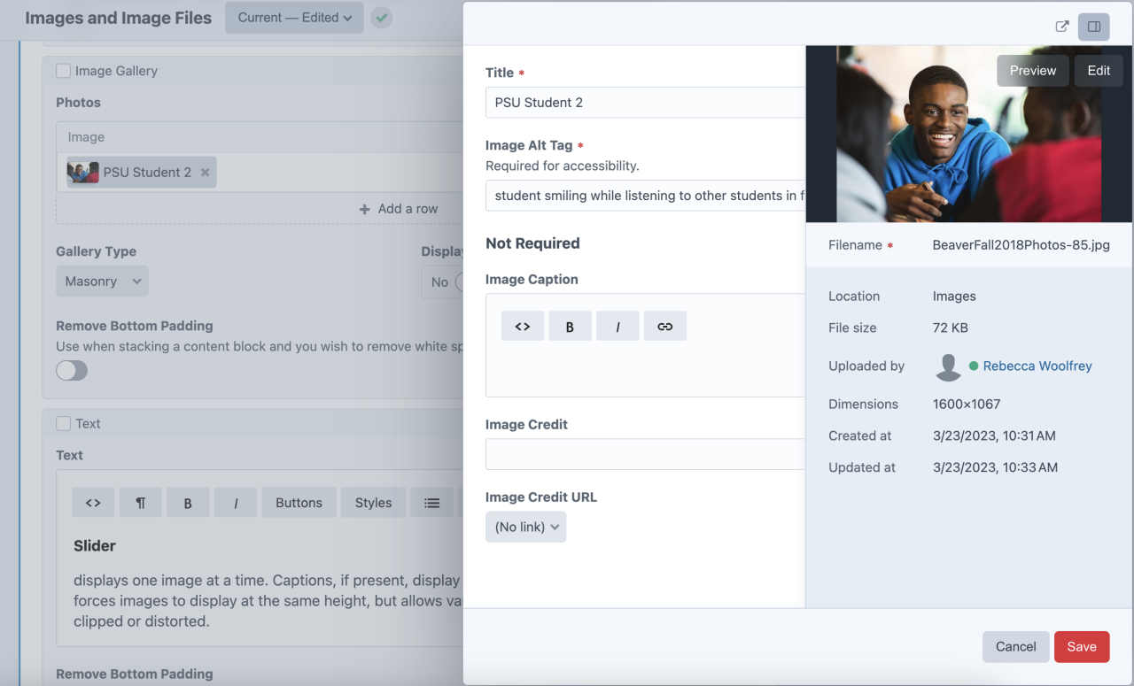
- Every image must have a title and alt text. The alt text allows a screen reader to describe the image to learners with visual impairments and is required for WCAG 2.0+ accessibility compliance. The title does not need to be the same as the filename.
- ❕Note: alt text should succinctly describe the visual content to someone with visual impairments.
- Image captions, image credits, and a URL for the credit (such as copyright details or original source) may be added.
- In Image Galleries, when captions are provided and toggled on, they will display as an overlay on the image, which the user can expand by clicking. ("Slider" style is the exception; captions appear below the image centered in the slider view.)
Interface view
Image Gallery Block - one image has been added and is being edited in the Image Panel at right.
Recommendations
- Visit the Image documentation to learn more about images.
- Editors might appreciate the Quick Start guide, which includes information about images.
- Learn about web accessibility including alt text.