
- On this Page
- Style & Appearance
- Examples
- Admin UI
- Recommendations
Style & Appearance
Description
Interactive blocks are a way for the user to interact with your website.
Available Styles
- Flip Cards - Present information on a two-sided “card” that the user can flip.
- Front can have any combination of: image, header, & text
- Back can have text
- Slide Cards - A variation to display longer text-based content without images.
- background colors
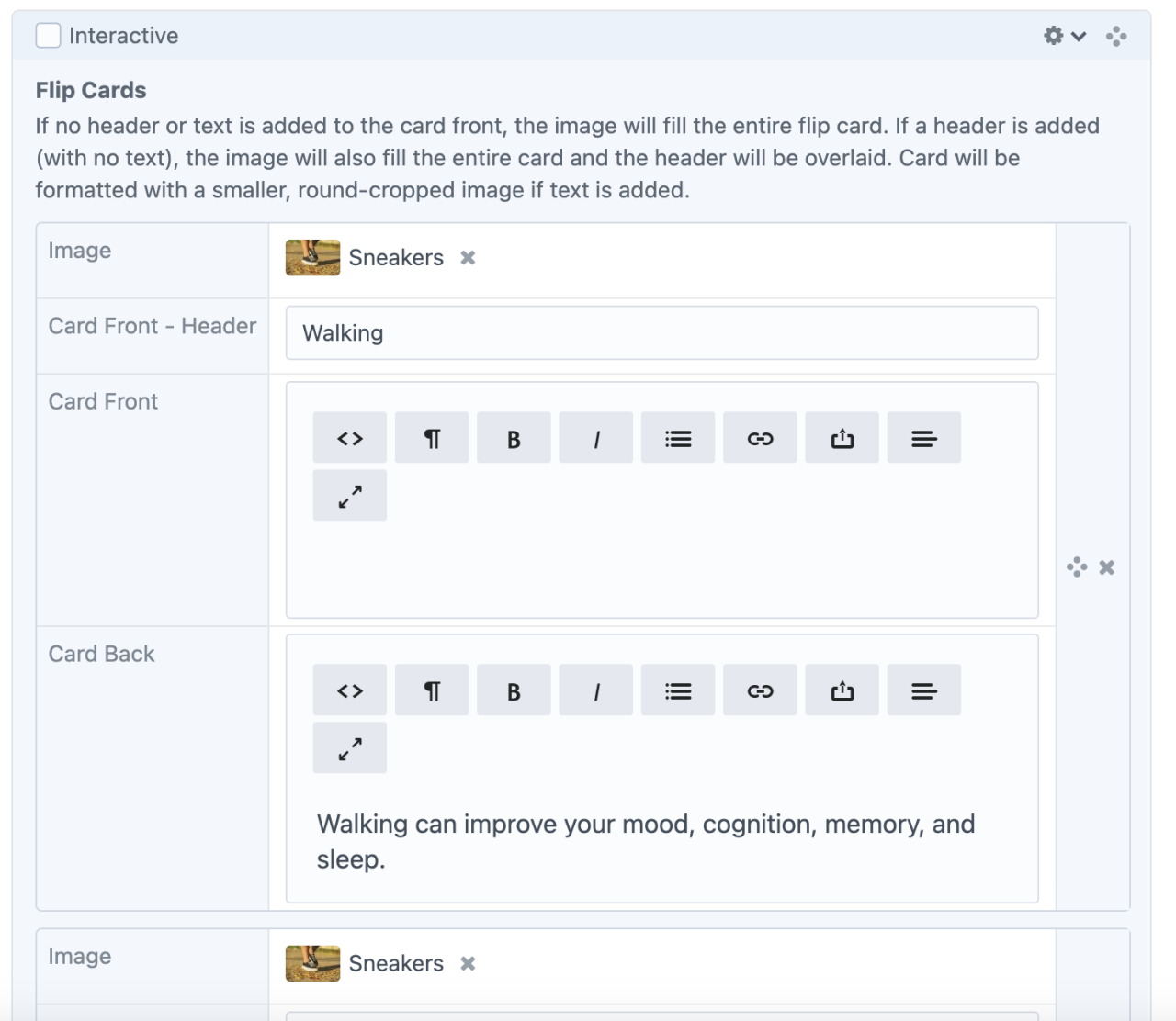
Interactive Flip Cards
Walking

Answer:
Walking can improve your mood, cognition, memory, and sleep.
Walking can improve your mood, cognition, memory, and sleep.
Answer:
Try taking a daily walk.
Walking
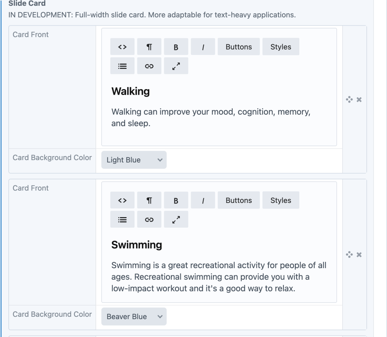
Walking can improve your mood, cognition, memory, and sleep.
Answer:
Try taking a daily walk
Walking
Answer:
Walking can improve your mood, cognition, memory, and sleep.
Walking
Walking can improve your mood, cognition, memory, and sleep.
Answer:
Try taking a daily walk.
Interactive Slide Cards
Examples
- Learning Grief - Secondary Losses
- Learning Grief - When Losses Compound
- Professional Learning - Teaching Difficult Issues (enrollment required)
- CCOR (in development)
Admin UI
Default Traits & Behaviors
- Flip cards
- cards display with a reverse symbol in the upper right corner to indicate interactivity to the user.
- cards return to their original state after a set time has passed.
- Construct flip cards with a variety of text and image combinations:
- The text on the back can include <h> tags, links, and other rich text elements
- Cards wrap according to view screen size. (1, 2, 3, or 4 across.)
- Slide cards
- The text will be larger for easy reading.
- The card is full-width and the height adjusts in response to the content, where all cards in a deck are the same height as the tallest.
- Instead of flipping, the front card slides to reveal the next card. Dots indicate the amount of cards in a stack.
Interface view
Flip Cards
Slide Cards
Recommendations
- Be succinct. Overly wordy flip cards will create a scroll bar.