
- On this Page
- Style & Appearance
- Examples
- Admin UI
- Recommendations
Style & Appearance
Description
This feature appears as a compact list, but each section can be expanded to reveal additional information.
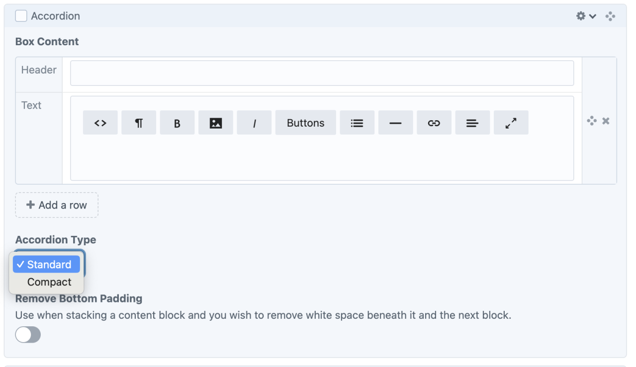
Available Styles
- Standard - expansion buttons aligned right, dividing line between rows, large space between rows
- Compact - expansion buttons aligned left, less space between rows
Standard Styling
Compact Styling
Admin UI
Default Traits & Behaviors
- The block begins with only one row; click the "Add a row" button to add as many rows as desired.
- Rows have two components: Headers and Text
- Headers top each row. Headers are visible when the box is collapsed.
- Text is exposed when the box is expanded.
- Expanded text remains expanded until the user clicks the icon to compress the row. All information can be expanded and visible at once.
- The Header field does not allow rich text editing, while the Text field does.
- Use the “line” tool to insert a horizontal rule (<hr>) within accordion text fields.
- Create and reorder as many rows as needed.
Interface view
Recommendations
- none specified