
- On this Page
- Style & Appearance
- Examples
- Admin UI
- Recommendations
Style & Appearance
Description
Dividers allow you to visually separate content.
Available Styles
- rule types:
- no rule
- single rule
- double rule
- thick rule
- striped rule
- accent image
- no image
- no clip
- circle clip
- square clip


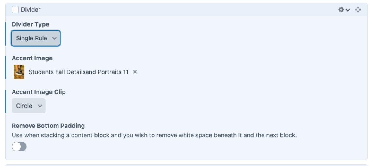
Admin UI
Default Traits & Behaviors
- Can apply any combination of lines, image/no image, and clips.
- Can remove bottom padding to reduce the space between the divider and the following component.
Interface view
Recommendations
- n/a