- On this Page
- Style & Appearance
- Examples
- Admin UI
- Recommendations
Style & Appearance
Description
When added to a page, the Glossary Highlighter block can enable glossary highlighting.
Available Styles
- n/a
Examples
- News Literacy Initiative - Basics | News Literacy Terms
- Graduate School - Policies
- Learning Grief - Key words (Highlighter is OFF)
- Professional Learning - Teaching Difficult Issues | Glossary (enrollment required)
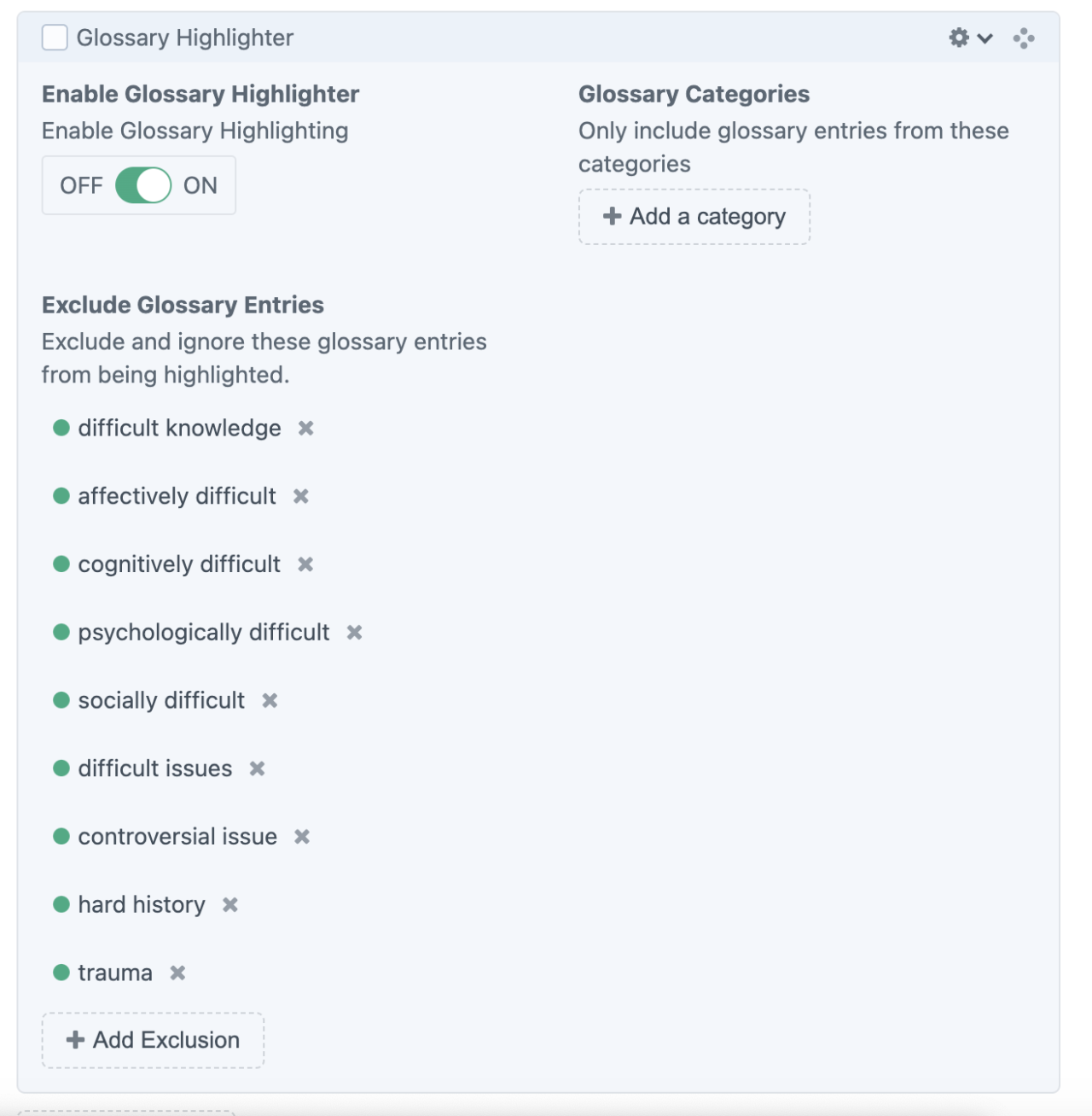
Admin UI
Default Traits & Behaviors
- The Glossary Highlighter block works in conjunction with the Glossary Channel.
- Glossary Channel entries are simple and include a plain text Title and Description field, plus an optional category selection.
- It doesn't matter where on the page you insert the block. The block is not visible to the website user.
- The default behavior of the Glossary Highlighter is to apply a Creek colored highlight to the first instance of any words found in the Glossary Channel.
- A question mark icon appears at the cursor when users mouseover a highlighted term.
- When users click the highlighted words, the word and definition open in a modal menu.
- It will not highlight subsequent instances of the same word on the page.
- When applied to another page, it will again highlight the first instance of the word.
- You can choose to exclude words on a page-by-page basis.
- You can choose to limit words by category on a page-by-page basis.
- The word (or phrase) must be exactly the same as the title in the Glossary Channel, with the exception of lettercase.
- This means, it will not highlight “child” when the word “children” is entered. This is true for instances like mice/mouse, shoe/shoes, doctor/Dr., etc.
- When the word title is a phrase like “controversial issue,” it will not highlight the word “controversial” unless it is directly followed by “issue.”
- The Glossary Highlighter will ignore text in some instances, such as headings and flip cards. These instances can be adjusted by our developer when needed.
Interface view