
- On this Page
- Style & Appearance
- Examples
- Admin UI
- Recommendations
Style & Appearance
Description
Buttons serve as links to other places.
Available Styles
- Button - These buttons work well placed below other content. Style options based on site theme.
- Primary
- Secondary
- Subtle
- Button - Call to Action - This button type allows you to enter descriptive text above the actual button.
- Button with Shield - This style of button allows your button to take up more space, visually, on the webpage. You can create a series of these buttons to tile across the page.
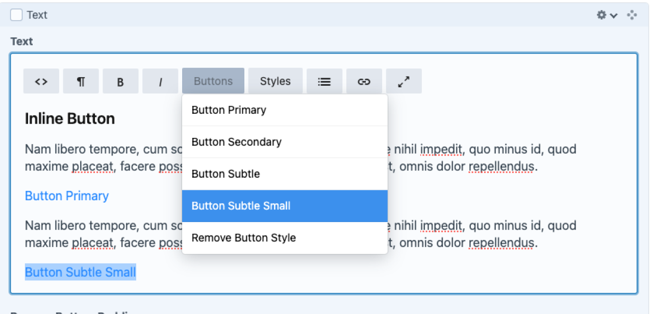
- Inline Button - Add a button inline within a text builder block
- Primary
- Secondary
- Subtle
- Subtle Small
Button
Button - Call to Action
Button with Shield
Inline Button
Nam libero tempore, cum soluta nobis est eligendi optio, cumque nihil impedit, quo minus id, quod maxime placeat, facere possimus, omnis voluptas assumenda est, omnis dolor repellendus.
Nam libero tempore, cum soluta nobis est eligendi optio, cumque nihil impedit, quo minus id, quod maxime placeat, facere possimus, omnis voluptas assumenda est, omnis dolor repellendus.
Multiple Buttons - Inline
Use one button block (Button, Button with Shield, or Button - Call to Action) to include multiple buttons inline. These buttons will be equally spaced and will wrap responsively according to screen size. Apply left or center alignment to buttons.
Multiple Buttons - Stacked
If you want your buttons stacked, not inline, use a separate block for each button.
Note: there may be a better option for what you're trying to achieve. Perhaps a Flexlist with links? Or put inline buttons inside a Container that forces them into a narrow content width? Please ask us if you have questions or need advice.
Admin UI
Default Traits & Behaviors
- The button text is what the user will see displayed on the button. You can select where the button takes the user. “Entry” is another location within your site, “Asset” links to a file, document, or image you’ve uploaded. And “URL” will take a user to an online location outside of your site.
- For regular Buttons, you can select whether to use the Primary, Secondary, or Subtle color in your theme. You can also select button alignment to be Left (default) or Center.
- Inline buttons have a fourth option: Subtle Small.
- Buttons will appear in a row if added one after the other.
Interface view
Recommendations
- none specified