- On this Page
- Style & Appearance
- Examples
- Admin UI
Style & Appearance
Description
Links that can give users a preview of content. This can be a combination of images, page titles, and preview text. Two blocks serve the purpose of providing a preview to content.
Available Blocks & Styles
- Preview - Cards
- Preview - Offset Preview
- Standard
- Small Image
- Primary Image
- Compact
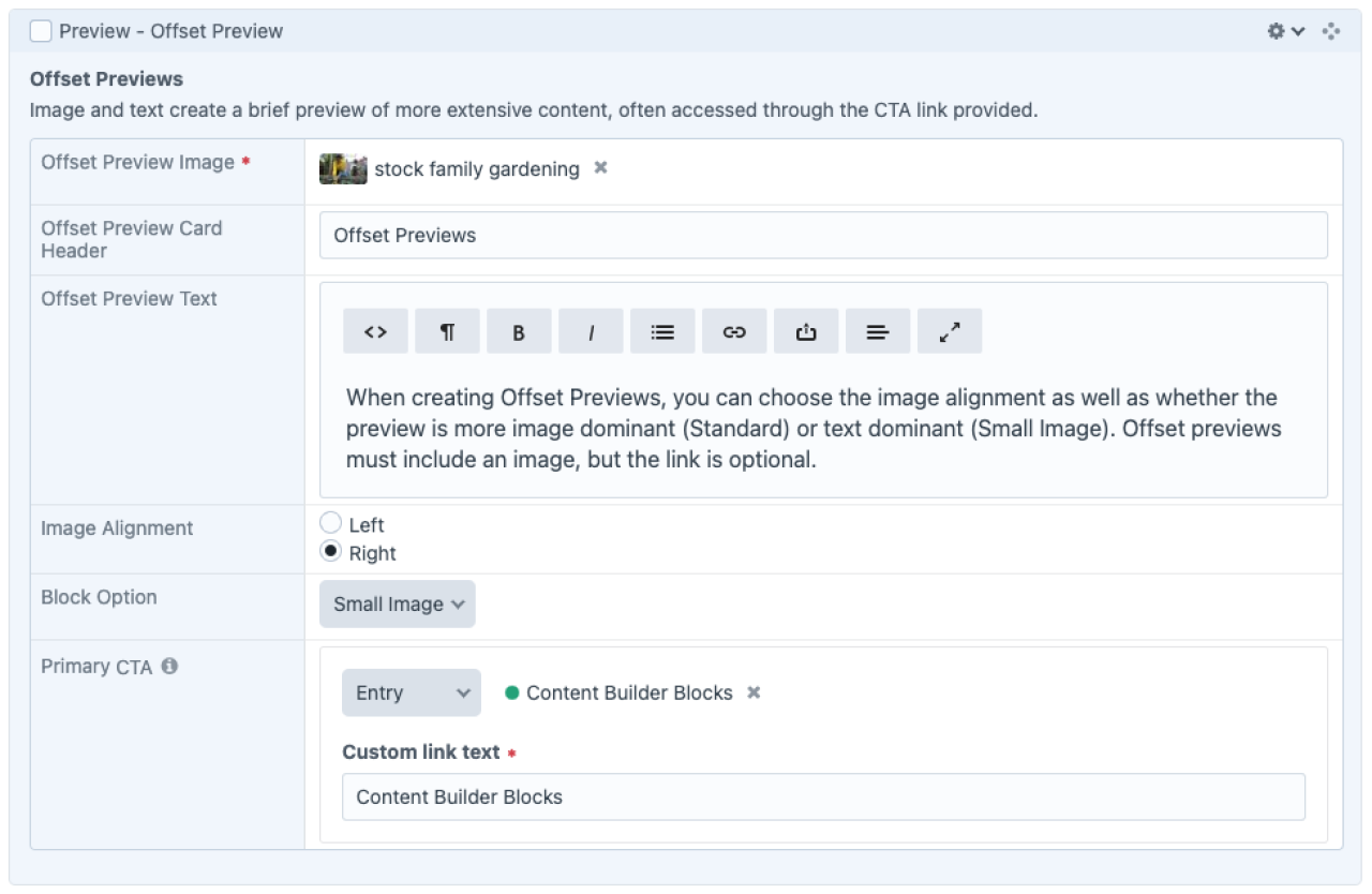
Preview - Offset Preview

Offset Previews
When creating Offset Previews, you can choose the image alignment as well as whether the preview is more image dominant (Standard) or text dominant (Small Image). Offset previews must include an image, but the link is optional.
Content Builder Blocks
Offset Previews
When creating Offset Previews, you can choose the image alignment as well as whether the preview is more image dominant (Standard) or text dominant (Small Image). Offset previews must include an image, but the link is optional.
Content Builder Blocks
Offset Previews
When creating Offset Previews, you can choose the image alignment as well as whether the preview is more image dominant (Standard) or text dominant (Small Image). Offset previews must include an image, but the link is optional.
A new type of offset preview allows for a primary image.

Admin UI
Default Traits & Behaviors
Offset Previews
- Image and text create a brief preview of more extensive content and provide a link to more.
- You must include an image, aligned to the right or left of the text.
- You must supply a title. You can optionally provide body text and a linked button.
- Standard Block style features a larger image, while the “Small Image” style accommodates text-heavy previews.
Interface view